Alright, last time I created a correlation matrix from this table. However, during Pubathon, it was pointed out that I should probably check to make sure I’m doing things correctly. As it turns out, I wasn’t (thanks, Matt!) Basically, I had to separate my normally-distributed and non-normally-distributed variables (as determined by a Shapiro-Wilk test), along with my continuous and categorical variables. However, since all my categorical variables were (unsurprisingly) non-normal, I just was left with two groups - normal and non-normal.
I compared the normal ones using Pearson’s test, the non-normal ones with Kendall rank-correlation test, and then cross-compared using Kendall rank-correlation again. This produced 3 sets of plots. Each set contains:
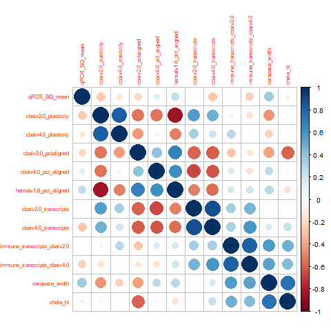
- 1 dot plot (big dot = higher absolute value of correlation, blue = positive, red = negative) and:
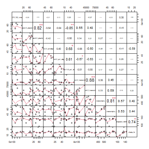
- 1 correlation chart (number = correlation, plot = plot of correlation)
Note: On the following plots, the variables can be tricky to see. The order of columns for each subset is the same (i.e. the normal-variables dot plot = the normal-variables correlation chart).
I also put a quick refresher on the transcriptome IDs and columns present at the bottom of this table. And if you want to see the initial correlation matrix that I created last time, check out my previous lab notebook post!
Normal Variables
Non-normal variables

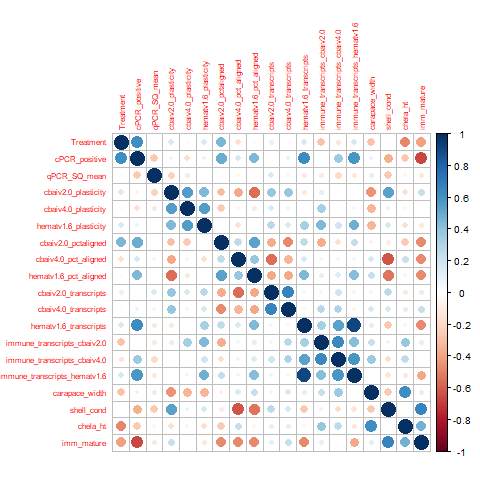
All variables
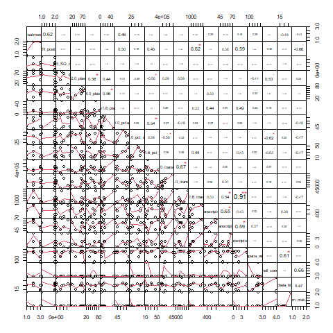
Interesting correlations:
Normally-distributed variables:
-
cbai_v2.0 plasticity and hemat_v1.6 pct aligned (-0.85): The higher the percentage of the libraries that was aligned to the Hematodinium transcriptome, the lower the overall plasticity was. However, note that this does NOT apply to cbai_v4.0 plasticity. Ultimately interesting. But unless we over-filtered to create our C. bairdi transcriptome, no clearly biologically meaningful link I see.
-
cbai_v4.0 immune transcripts and hemat_v1.6 immune transcripts (0.81): Makes sense - more activity on the part of the parasite (or host) means more activity on the part of the other! However, take this with a grain of salt - the number of hemat_v1.6 immune transcripts maxes out at 5.
-
cbai_v4.0 percent aligned and hemat_v1.6 percent aligned (0.61): Also somewhat expected - more alignment to the crab equals more alignment to the parasite. Doesn’t seem particularly remarkable though
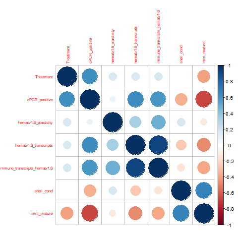
Non-normally-distributed variables
Nothing particularly interesting here sadly
All variables
- cbai_v2.0/v4.0 plasticity and hemat_v1.6 plasticity (0.56). Generally, a more plastic parasite means a more plastic host and vice-versa. This is pretty dang neat! Not a super great correlation, but still hey, cool finding!
Alright, well we found a few neat linkages. Glad I took the time to redo that one! Anyway, I’ll bring em up during lab meeting tomorrow and see what people think. End of the main post, though there is a refresher below on some of the notation used here
Refresher on Transcriptomes and Columns
As a reminder, the three transcriptomes used for alignment in this experiment are:
- cbai_transcriptomev2.0: unfiltered by taxa
- cbai_transcriptomev4.0: filtered, presumably only C. bairdi seqs
- hemat_transcriptomev1.6: filtered, presumably only Hematodinium seqs
The following columns are present in the original data file:
-
Crab ID (A-I). Removed from this analysis because it doesn’t describe any characteristic of the crabs
-
Uniq_ID: This links the notation used in Grace’s analysis (and mine) with some of the earlier Jensen tables. Also removed for the same reason above
-
Treatment: The temperature treatment the crab was exposed to
-
Timepoints:The number of timepoints (3 for ambient- and lowered-temperature treatment groups, 2 for elevated)
-
cPCR_Positive: Did the crab test positive for Hematodinium with conventional PCR?
-
qPCR_SQ_mean (one column for each of 2 timepoints). The qPCR results when tested for Hematodinium. Higher = more Hematodinium present
-
Plasticity (three columns, one for each transcriptome): I created PCAs with each aligned library as a single plot. This value is the mean distance between each individual library for that crab and the overall centroid for that crab.
-
Pct Aligned (three columns, one for each transcriptome): Using kallisto, I aligned libraries to the transcriptome. This is the mean percent aligned for libraries belonging to that crab.
-
Transcripts (three columns, one for each transcriptome): The total number of expressed transcripts in all samples for that crab. (e.g. if Transcript 1 is expressed in all samples for Crab A, it’s still only counted as one transcript).
-
Immune Transcripts (three columns, one for each transcriptome): Same as above, but ONLY counting transcripts associated with the GO term for immune response
-
Carapace Width: The width of the crab carapace (not inclusive of spines)
-
Shell Condition: The level of wear on the shell. Roughly corresponds to time since molt
-
Chela Height: The height of the right claw (chela). The ratio of carapace width to chela height indicates whether the crab is mature
-
Imm_Mature: Whether the crab is immature or mature
-
Death: The date of death, if applicable. Removed from this analysis because of NAs